How to make 3D text readable in VR
Unity VR text readability: size 3D text by angular size, choose contrast and materials, handle grazing angles and stereo, seat text on panels and budget for Quest.
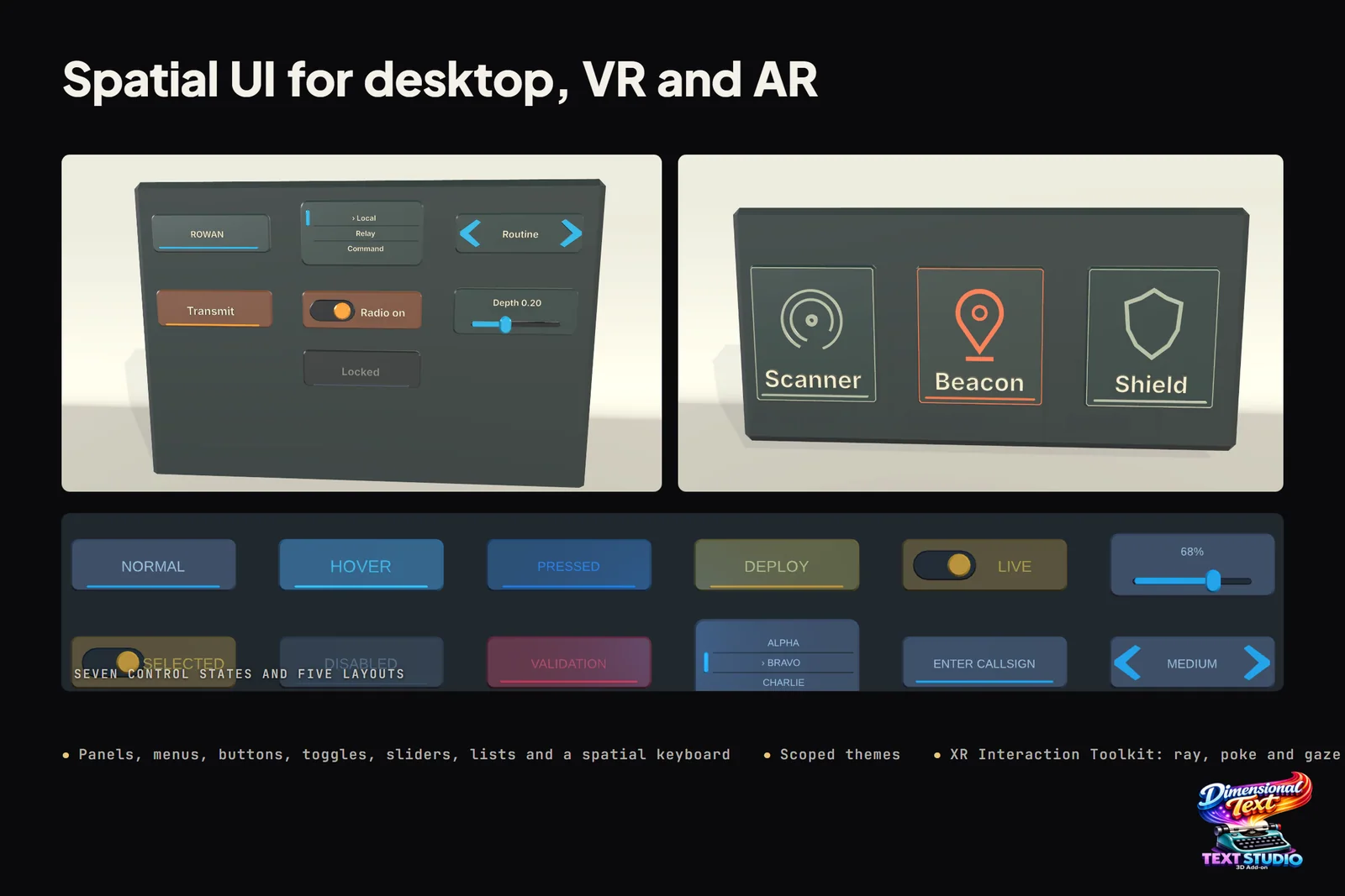
Text in VR fails in a few predictable ways. It is too small for its distance, it shimmers when the head moves, it collapses into a sliver when seen from the side, or it floats at a depth the eyes keep refocusing on. The fixes are mostly measurement: size text by the angle it covers, give it strong contrast, keep it facing the reader and sitting on its surface, and turn on MSAA for the edges it can smooth.
Real 3D geometry solves some of these problems and makes others worse. I built Text Studio 3D, which turns TextMeshPro text into solid letters, so I have a stake in the answer. The platform guidance below comes from Microsoft, Apple and Meta, and Microsoft and Apple agree on the point that matters most here: text people need to read should stay flat or nearly flat. Solid letters earn their place in titles, signs, scoreboards and buttons that belong to the world.
VR text readability starts with angular size
A font size means nothing in a headset until you know how far away the text is. What the eye judges is the angle the letters cover:
angle = 2 * atan(height / (2 * distance))height = 2 * distance * tan(angle / 2)Microsoft’s mixed reality user research gives the most concrete published targets (Typography):
| Viewing distance | Minimum legible | Comfortably legible |
|---|---|---|
| 45 cm (hand reach) | 0.4° to 0.5° (3.14 to 3.9 mm) | 0.65° to 0.8° (5.1 to 6.3 mm) |
| 2 m | 0.35° to 0.4° (12.21 to 13.97 mm) | 0.6° to 0.75° (20.9 to 26.2 mm) |
Microsoft converts these heights to font sizes at about 2,835 points per meter (Text in Unity), so compare them with your text’s font size, not its cap height. Microsoft wrote this guidance for HoloLens, so treat the numbers as a starting point. Meta’s typography guidance insists on testing type on the headset itself (Meta typography), and Apple’s visionOS defines its point as an angle, scaling windows with distance so they keep their apparent size (Spatial layout).
A worked example: a label 2 cm tall seen from 2 m covers 2 × atan(0.02 / 4), about 0.57°. That clears Microsoft’s minimum but sits just under its comfortable range, so 2.5 cm (about 0.72°) is the better size. A 10 cm title at 3 m covers about 1.9° and reads easily.
Weight matters as much as size. Microsoft warns that light and semilight weights below 42 pt make thin vertical strokes vibrate, Meta finds Medium, Bold and Black more legible than Light and Thin, and Apple suggests bold text when nothing sits behind it. Solid letters follow the same rule: a thin face becomes thin strokes, and strokes narrower than a pixel or two flicker on any renderer.
Contrast and materials that stay readable
Apple asks for maximum contrast between text and its background (visionOS typography), Microsoft recommends white text on a dark or colored back plate, and Meta warns that bright rooms in mixed reality wash out subtle text while dark surroundings make bright text look harsh. A back plate solves most of this, because it controls what sits behind the letters.
Solid letters add one decision: which surface carries the reading. Keep the front face matte and evenly lit, in a color that contrasts with the panel, and give the bevels and sides a darker material so each letter’s edge separates from the background. Avoid mirror chrome or high gloss on text people must read, because its reflections move with the head and can swamp the letter’s own color; keep chrome, glass and brass for titles. In a dark scene, a little emission on the front face keeps a label legible without depending on scene lights.
Text Studio 3D assigns materials by region (front face, bevels, outer sides, back and more), and a Material Set applies a coordinated set at once. The Readable Materials sample compares material regions, premium surfaces and restrained lighting side by side; open it in the headset before you settle on a look.
Why solid letters hold up at grazing angles and in stereo
TextMeshPro and UI Toolkit draw each glyph on a flat quad and compute its edge in the pixel shader from a signed distance field. That is why flat text is so crisp head-on, and it also means the hardware antialiasing never sees the letter’s edge: MSAA smooths triangle edges, and the edge of an SDF letter lies inside the triangle. As the quad turns toward a grazing angle, each glyph squeezes into fewer pixels and its edge smoothing has less to work with, which shows up in a headset as shimmer while the head moves. Developers have reported this for years, from TextMeshPro text shimmering at a distance in VR to outlines that vanish unless viewed head-on.
Solid letters behave like any other mesh. Their silhouettes are triangle edges, so the MSAA that Meta tells Quest developers to use almost always, at no more than 4x, smooths them (MSAA analysis). From the side, a letter still shows its face, bevel and wall instead of collapsing to a line, and because each eye sees the sides from a slightly different angle, the stereo image reads as an object in the room rather than a decal.
There are limits, and they matter. When letters get small, flat SDF text is often the crisper choice, because its smoothing is computed for every pixel while geometry depends on multisampling, and strokes thinner than a pixel or two flicker either way. Depth also costs legibility: Microsoft’s typography guidance says extruded type tends to hurt readability outside logotypes, and Apple’s visionOS guidelines recommend little or no visual depth for text people need to read.
So split the job. Keep body text, captions and small labels flat. Use solid letters with modest depth for titles, signs, scoreboards and buttons. For a label tied to an object people walk around, Apple recommends billboarding so the text keeps facing the wearer; for signs that are part of the world and seen from many angles, real geometry is the better answer.
Seat 3D text on its panel instead of floating it
Apple’s spatial layout guidance is blunt about depth: text that appears to hover above its background is hard to read and can cause visual discomfort, and every change in depth makes the eyes refocus. For 3D labels on a panel:
- Put the letters’ back on the panel. Since 1.4.0, Text Studio 3D’s Depth Anchor (Front, Center or Back) places lettering relative to its origin; Back, the default for new components, keeps the whole text, outlines included, in front of the origin, so an origin on the panel surface seats the letters without cutting into it.
- Keep depth modest relative to letter height for anything people read, and use the same depth for every label on a panel so the eyes do not refocus between them.
- If a label has to stand off a surface, give it its own backing so letters and plate read as one object. Text Studio 3D can generate backings, badges and shields behind text.
- Keep interaction feedback subtle. The spatial UI controls show hover and press with tint, scale and depth changes that do not rebuild the letters, and the optional XR Interaction Toolkit integration adds ray, poke and gaze input.
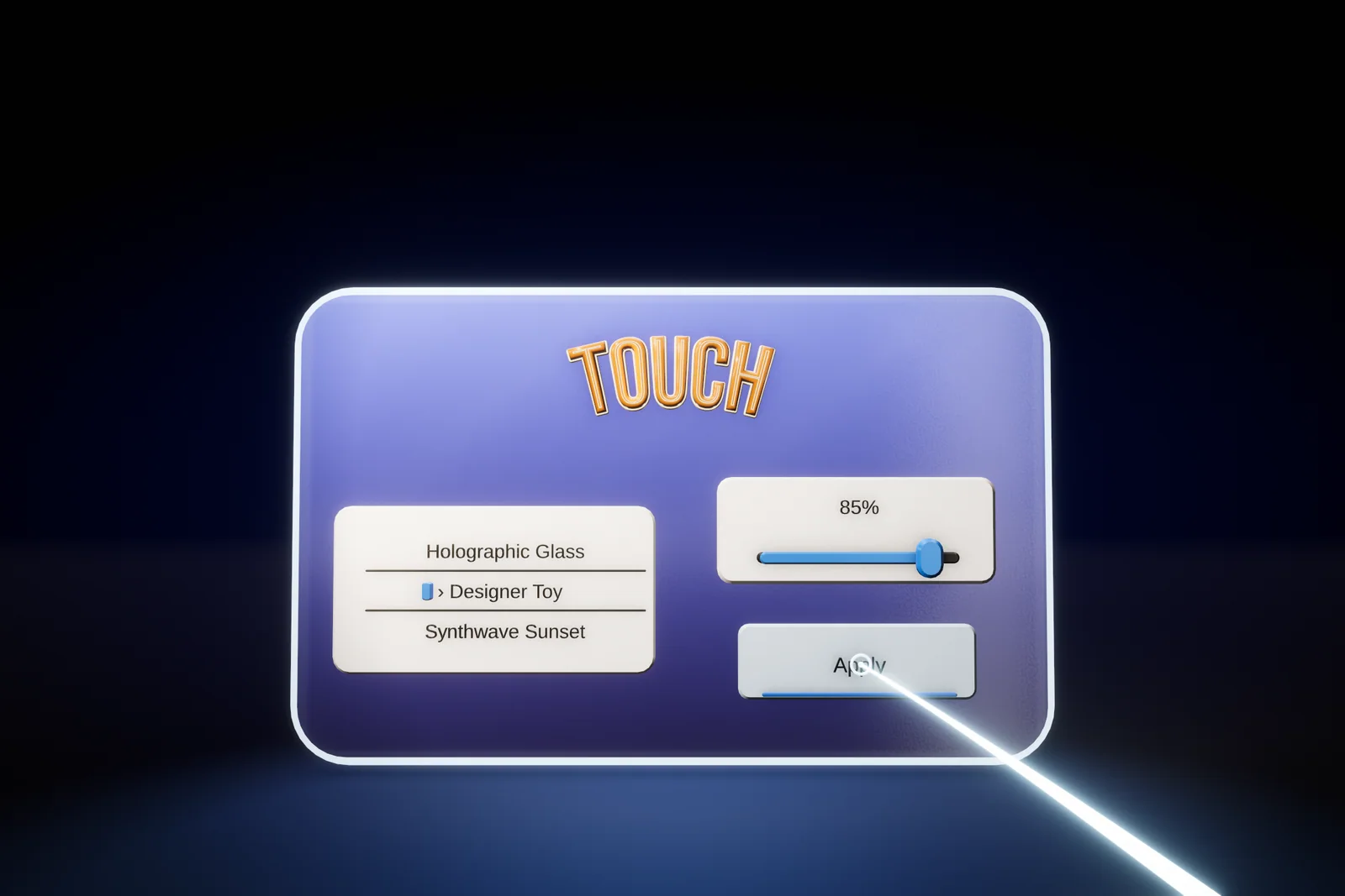 A spatial UI panel: a solid TOUCH header above a list, a slider and an Apply button, with a pointer ray on the button.
The manual chapter Build Spatial Interfaces lists every control, and world-space and VR menus shows a complete menu.
Motion, comfort and Reduced Motion
Moving text is harder to read and can be uncomfortable to watch. Apple recommends keeping important content centered without distracting motion or bright, high-contrast objects in the periphery, and anchoring content in the room rather than to the wearer’s head.
Text Studio handles this with a motion policy: project settings and each text object can choose Full, Reduced or No Motion. Reduced Motion keeps the meaning of an effect while lowering displacement, rotation, flashing and depth travel, and No Motion keeps a stable, readable result. Native 3D effects expose their own reduced-motion controls too. In practice, let reveals finish quickly and then hold still, keep idle loops small and slow on anything people read, and test every menu once with Reduced Motion on.
Keep 3D text fast on Quest
Standalone headsets usually run out of GPU time and thermal headroom before CPU time, so measure a release build on the device rather than in the editor. Then match the output to the job:
- Static titles and signs: Combined Mesh. Prepare fixed wording with Prepare this text, or freeze a finished title with Strict Freeze.
- Labels that change: the Realtime profile with Chunked Combined Mesh, Balanced mesh detail, and High only for text read up close.
- Scores and countdowns: Numeric Value text, which since 1.4.0 rebuilds only the digits that change on compatible Combined Mesh output.
- Materials: opaque Lit styles for dense labels. Glass draws a second transparent pass for its interior, so save it for titles.
The Lit and Glass shaders support single-pass instanced stereo, and Text Studio 3D is measured on Meta Quest 3. Version 1.4.0 cut the first frame of a revealed level title on Quest 3 from 74 ms to about 18 ms of Text Studio 3D render time, and the next frame from 8 ms to 0.5 ms (the first frame on Quest). In a Quest game with its own text materials, 1.4.0 also cut Text Studio’s share of the build from 93.7 MB to 0.7 MB. I use it in production too: Snowball Party, our own mixed reality snowball fight for Meta Quest, uses Text Studio for lots of real-time 3D text. The manual chapter Choose Output and Performance and 3D text on mobile and Quest cover the details.
Frequently asked questions
How big should text be in VR?
Size it by angle. Microsoft's mixed reality research puts the minimum legible size at 2 m at 0.35 to 0.4 degrees (12.21 to 13.97 mm) and the comfortable size at 0.6 to 0.75 degrees (20.9 to 26.2 mm); at 45 cm the ranges are 0.4 to 0.5 and 0.65 to 0.8 degrees. Confirm the result in your own headset.
Is extruded 3D text harder to read in VR than flat text?
For body text, usually yes. Apple and Microsoft both recommend flat or nearly flat text for anything people need to read. Solid letters work best for titles, signs, scoreboards and buttons, with modest depth, a matte front face and the text facing the reader.
Why does TextMeshPro text shimmer in VR?
TextMeshPro computes each letter's edge in the pixel shader, so MSAA cannot smooth it, and small or steeply angled text has too few pixels for that edge. Larger angular sizes, regular or bold weights, uniform scale and text that faces the reader all help.
Does Text Studio 3D work on Meta Quest?
Yes. Its Lit and Glass shaders support single-pass instanced stereo, it is measured on Meta Quest 3, and an optional XR Interaction Toolkit integration drives its spatial UI. Version 1.4.0 cut the first frame of a revealed title on Quest 3 from 74 ms to about 18 ms of Text Studio 3D render time.
Real 3D text for Unity, built from your TextMeshPro text.
Keep reading
 Use case
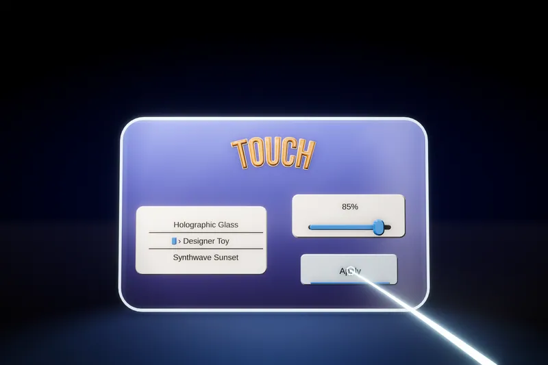
3D menus and world-space UI for VR and AR
A flat canvas in a headset reads like a sticker. Text Studio 3D builds menus, controls and a spatial keyboard from solid, lit 3D text, with themes, optional XR Interaction Toolkit input and single-pass instanced stereo.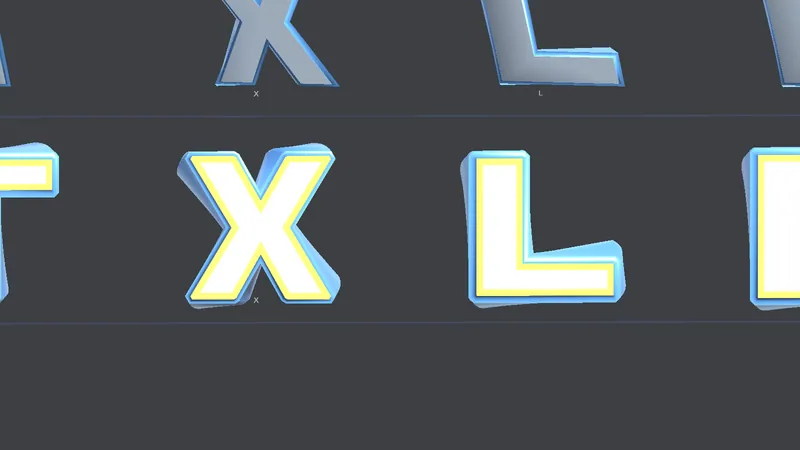 Use case
Fast 3D text on mobile and Quest, with small builds
Phones and headsets run out of GPU time and heat before CPU. How to pick output, mesh detail and prepared geometry for them, and what Text Studio 3D 1.4.0 changed: Quest 3 first frame 74 to about 18 ms, build share 93.7 to 0.7 MB.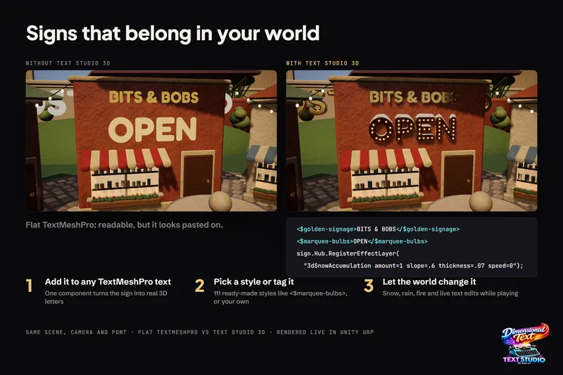 Comparison