Outlines, glows, gradients and bevels for TextMeshPro
Style TextMeshPro text with outer and multiple outlines, glows, gradients, bevels and faux depth. Start from 60+ ready-made looks or stack your own layers.
TextMeshPro renders crisp text, and its distance field shaders cover the basics. Per Unity’s TextMeshPro documentation, outline, underlay, bevel and glow are material settings that apply to the whole text object. That is where the questions start: how to put the outline outside the letters, how to get two outlines, how to give one word its own gradient. Threads such as please provide a proper way to make textshadow/glow stay active for years, and a May 2026 question about a thick outer outline eating into the font face has no replies. The common workaround is stacking several TextMeshPro copies on top of each other.
Text Studio adds a layered Appearance on top of TextMeshPro, close to layer styles in an image editor but live in Unity, on the text you already have.
Start from a look
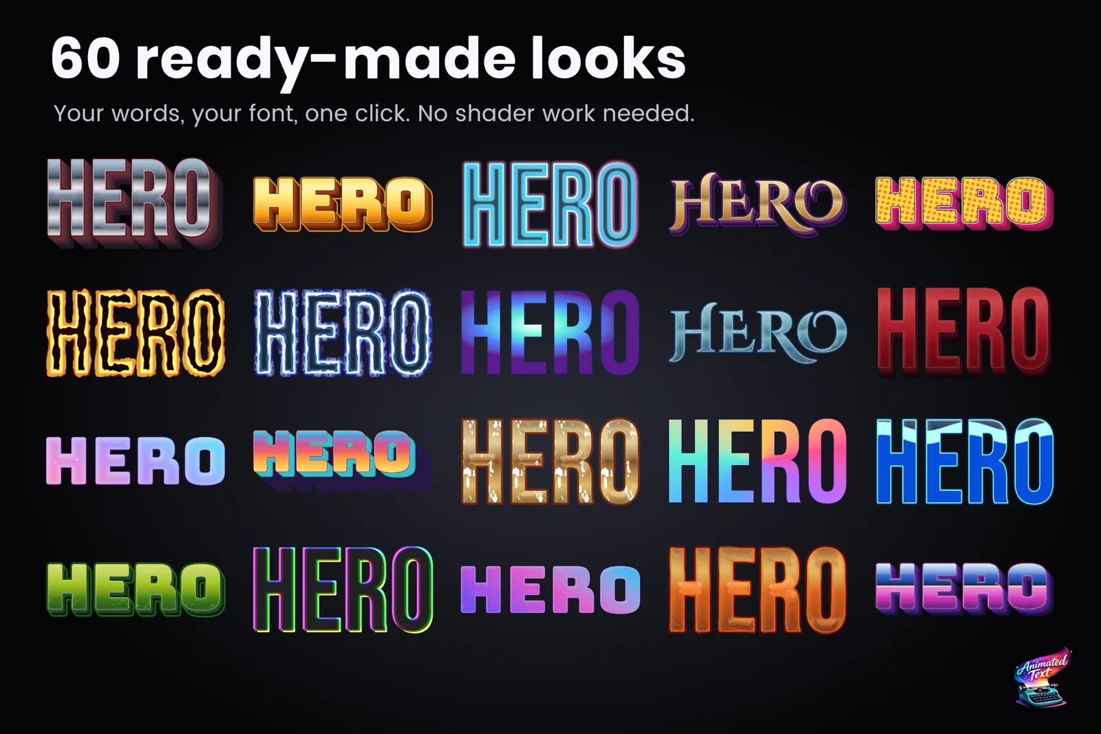
Open the Appearance tab of a Text Studio text and choose Catalog. Browse opens the style browser with 60+ ready-made looks, including Cinematic Gold, Neon Cyan, Chrome Title, Comic Impact, Holographic Foil, Ice Crystal, Sci-Fi HUD and Mobile UI, with search, favorites and recent choices. A look applies to your words in your font with one click, and the Inspector previews the selected style directly. Directional styles get a preview-only light you can sweep across the letters before deciding.
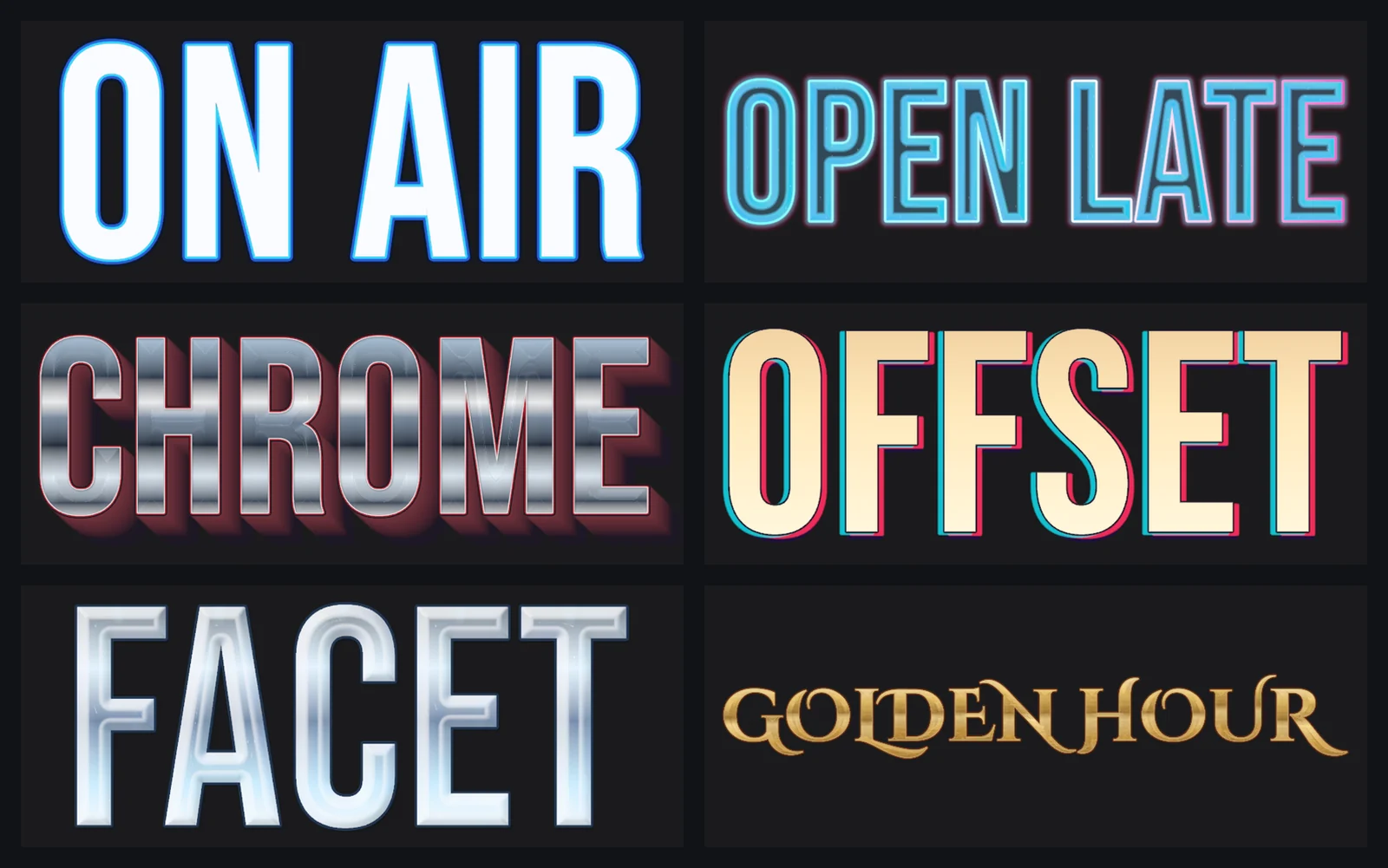
Make Inline copies a catalog look into local layers you can edit, Save turns your stack into a reusable style asset, and Save & Register adds it to the catalog for the rest of the team. Editing a linked style updates every text that uses it.
Build your own stack
An Appearance is a stack: the top row paints in front of the rows below. The layer kinds cover most title design:
- Structure: fill, inside or outside strokes with round, miter or bevel joins, contour dashes, inner and outer shadows, glow and adaptive faux depth.
- Surface: bevel plus calibrated material responses such as metal, foil, chrome, ice, glass, gel, enamel, neon, embossed and holographic, with optional normal maps and HDR reflection maps.
- Editorial: halftone, grain, duotone, distress, ink bleed, letterpress, stencil, sticker plate, CMYK offset, RGB separation, prismatic edge and engraved line.
- Animated title treatments: sweep, shimmer, liquid fill, burning or electric edges, glitch and heat distortion, dissolve, trails, smear and progressive focus.
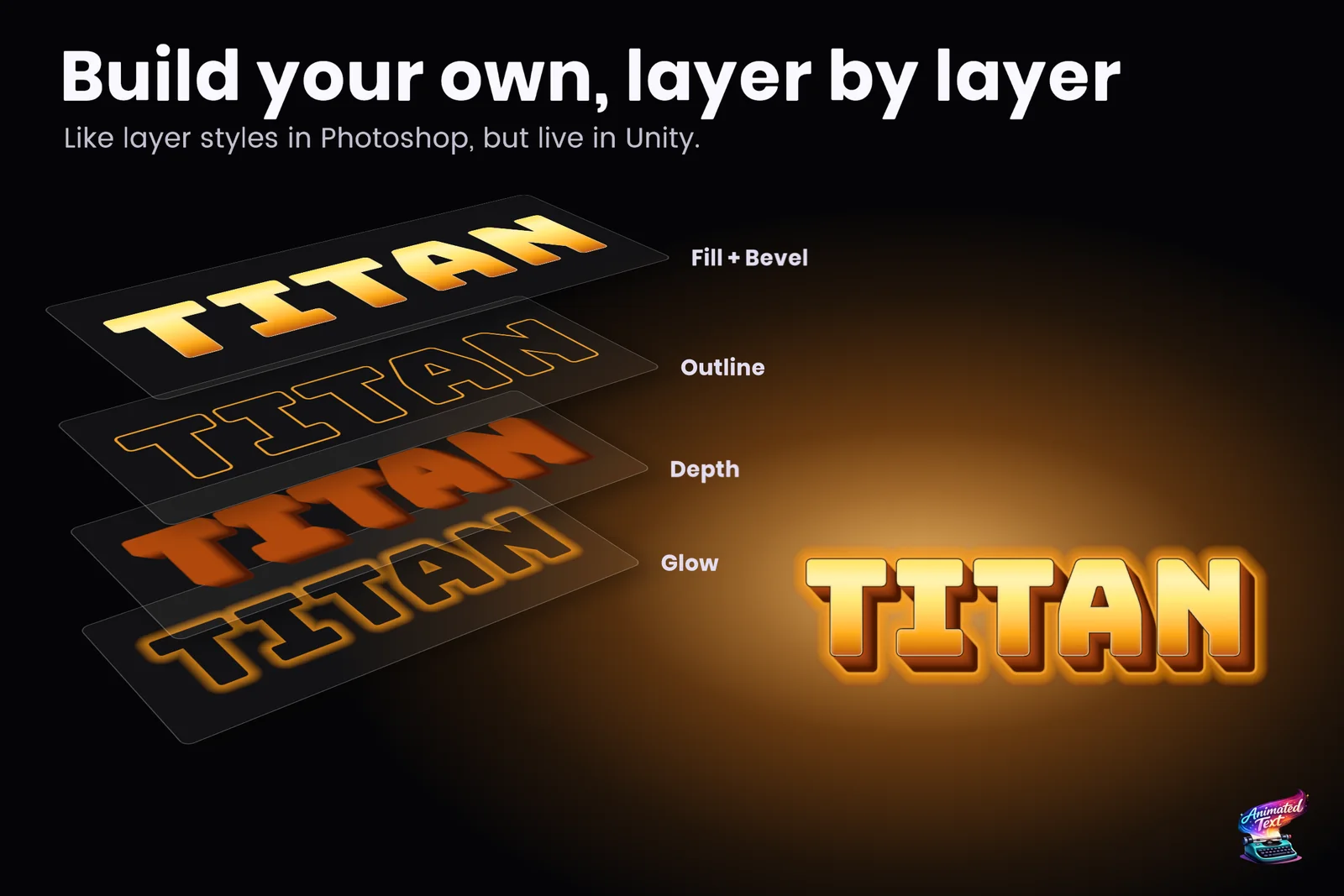
A restrained stack of two or three layers usually reads better, batches better and adapts more easily than one that shows every feature at once.
Outer outlines and multiple outlines
A stroke can sit inside or outside the glyph edge, and you can stack as many as the design needs: a thin dark line against the letters, a wide colored band outside it, a glow beyond that. Strokes, outer glows and outer shadows placed below faux depth wrap the complete extruded silhouette, including taper and outset, so a 3D-looking title keeps a clean contour. Wide strokes are not clipped when the TextMeshPro padding is smaller than the stroke.
Exact contour joins and dashes need prepared font data. Tools > Text Studio > Runtime Preparation checks open scenes and build content and prepares it with one action, and Prepare automatically before each build keeps it current.
Gradients that follow the words
A Paint can be a solid color, a linear, radial or conic gradient, a texture, a repeating pattern or filtered procedural noise. Mapping decides the coordinate frame: per glyph, word, line, tagged match or the entire text, so a gradient can restart on every word or flow across a wrapped paragraph. A shared Paint asset (Assets > Create > Text Studio > Appearance > Paint) keeps related labels consistent, and Gradient Dither adds stable noise that hides banding in 8-bit output.
Style one phrase with a tag
Register a style in the project’s appearance catalog with an ID such as warning, then apply it to a phrase:
<$warning>Low health</$warning><$warning mode=overlay tint=#ffcc66 opacity=0.8>Low health</$warning><style fill=#ffcc66 outline=#332211 outlineWidth=0.04>Notice</style>The first replaces the surrounding look inside its range, mode=overlay adds it on top, and the inline <style> form handles a one-off treatment, with outline widths in em units. TextMeshPro’s own <style="Title"> keeps using the TMP style sheet.
Lines, highlights and plates
Underline, overline and strikethrough come in solid, double, dotted, dashed and wavy patterns, with skip ink that leaves gaps around descenders. Connected range highlights follow a selected passage across line wraps, and backgrounds, borders and glyph-derived backplates frame a word or a whole caption. The typewriter knows about them, so a backing plate appears with its text.
Fast on phones and headsets
Text Studio 1.3 reworked 2D style rendering for mobile GPUs and standalone XR:
- Simple Native quality styles with one solid fill, a round outline and a distance field outer shadow use TextMeshPro’s own SDF rendering by default. Choose Exact Layering when overlapping letters must keep precise layer order.
- In measured Quest 3 scenes, 200 labels with fill, outline and shadow rendered about 18 times faster than before; on an Adreno 619 phone, an eight-layer 1400 px animated title dropped from 649 to 42 ms of GPU time per frame.
- Player builds include only the Text Studio features your texts use, so projects without 2D looks do not ship their shaders, about 11.5 MB for 2D Appearance alone.
The article styled text on phones and Quest covers the measurements.
Limits worth knowing
- The layered looks render on TextMeshPro output, and on UniText through its integration. UI Toolkit labels get the typewriter, effects and profiles, not the layered looks.
- Prepared font data covers the characters you prepare. For names or server text added at runtime, add the character sets and phrases you expect in Runtime Preparation.
- Very large blur areas and history-based treatments can dominate memory even with few layers. Profile on the target device.
The manual chapter Design Persistent 2D Text documents every layer and setting. To animate these looks, combine them with tag effects; for whole title sequences, see animated titles and HUD text.
Frequently asked questions
How do I put an outline outside the letters in TextMeshPro?
Add a stroke layer to the text's Appearance and place it outside the glyph, with round, miter or bevel joins. Wide strokes are not clipped when the TextMeshPro padding is smaller than the stroke, a fix that shipped in Text Studio 1.3.
Can text have more than one outline?
Yes. An Appearance is a stack of layers, so you can add several strokes in different colors and widths, plus shadows and glows. The ready-made Layered Outline look is a starting point.
Can a gradient follow each word instead of the whole text?
Yes. Paint mapping can follow a glyph, a word, a line, a tagged match or the entire text. Linear, radial and conic gradients, textures, patterns and noise are available, and Gradient Dither reduces banding.
Is layered text fast enough for mobile and Quest?
Simple styles with one fill, a round outline and a soft shadow use TextMeshPro's own SDF rendering by default. In measured Quest 3 scenes, 200 labels with fill, outline and shadow rendered about 18 times faster in 1.3 than before.
Style and animate every word in Unity.
Keep reading
 Use case
Animated titles, menus, HUD text and score counters
Title screens, chapter cards, objectives, prompts, combo words and scores: how to give interface text a look, a short entrance and a reaction to change, without keeping a busy HUD animating every frame. Use case
Wave, shake and rainbow text with tags
Wrap a word in <wave> or <shake> and it moves, in the Inspector and in the build. 40+ effects, named parameters, nesting, reusable Composed Effects and your own project tags.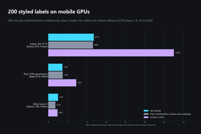 Article