Chart language used in this guide
A chart has a few named regions and building blocks. Knowing these terms makes the Inspector and API much easier to understand.
Term | Meaning |
|---|---|
Chart area | The whole rectangle reserved for the chart, including title, subtitle, plot, axes, legend, labels, background, and border. |
Plot area | The inner data region where bars, lines, points, areas, heatmap cells, and reference rules are drawn. |
Mark | One visual data item or part of a series. Examples: BarMark, LineMark, AreaMark, PointMark, SectorMark, RectangleMark, RuleMark, RadarMark, and CandleStickMark. |
Axis | A value or category guide. Cartesian charts normally use an X axis and a Y axis. Pie, donut, radar, and compact charts usually hide axes. |
Scale and domain | The scale converts data values to positions. The domain is the range of data values shown, such as 0 to 100 or Jan to Dec. |
Tick and grid line | A tick is a labeled value on an axis. A grid line extends a tick across the plot area to help compare values. |
Series | A group of related marks, such as Sales and Expenses. Series keys drive grouping, stacking, colors, and legend entries. |
Legend | The label list that explains series colors, symbols, or categories. |
Title and subtitle | Text attached to the chart area, typically used for the main message and context such as period, units, or filter. |
Data label and annotation | A data label shows a value near a mark. An annotation is richer explanatory text attached to a mark or reference line. |
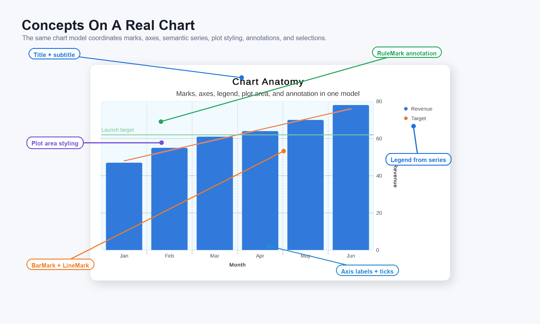
Figure 1. Chart anatomy: title, subtitle, plot area, axes, legend, marks, annotations, and encoded series are separate parts of the same Chart model.