Series Data
The Series Data tab generates patterned numerical datasets - the kind of data you feed into charts, graphs, dashboards, and data visualizations. Each dataset consists of labeled data points with values that follow a mathematical pattern.
This lets charts and analytical interfaces communicate a real scenario before production metrics exist. Create growth, seasonality, comparison, sparse-event, distribution, or financial-style data with a recognizable shape instead of hand-authoring disposable arrays.
Using the Series Data Tab
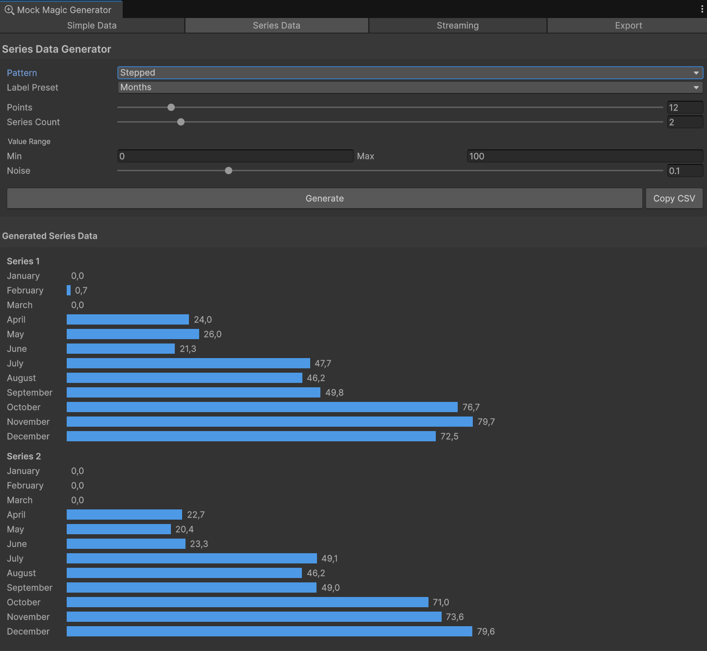
- Pattern - Select from 15 mathematical patterns (see Pattern Reference below).
- Label Preset - Choose how data points are labeled on the X-axis: months, weekdays, quarters, numeric indices, and more.
- Points - Set how many data points per series (3–100).
- Series Count - Generate multiple series at once (1–10). Useful for grouped/stacked charts or comparisons.
- Min / Max - Define the value range for generated data.
- Noise - Add randomness to the pattern (0 = perfectly clean, 0.5 = very noisy). Noise makes data look more realistic.
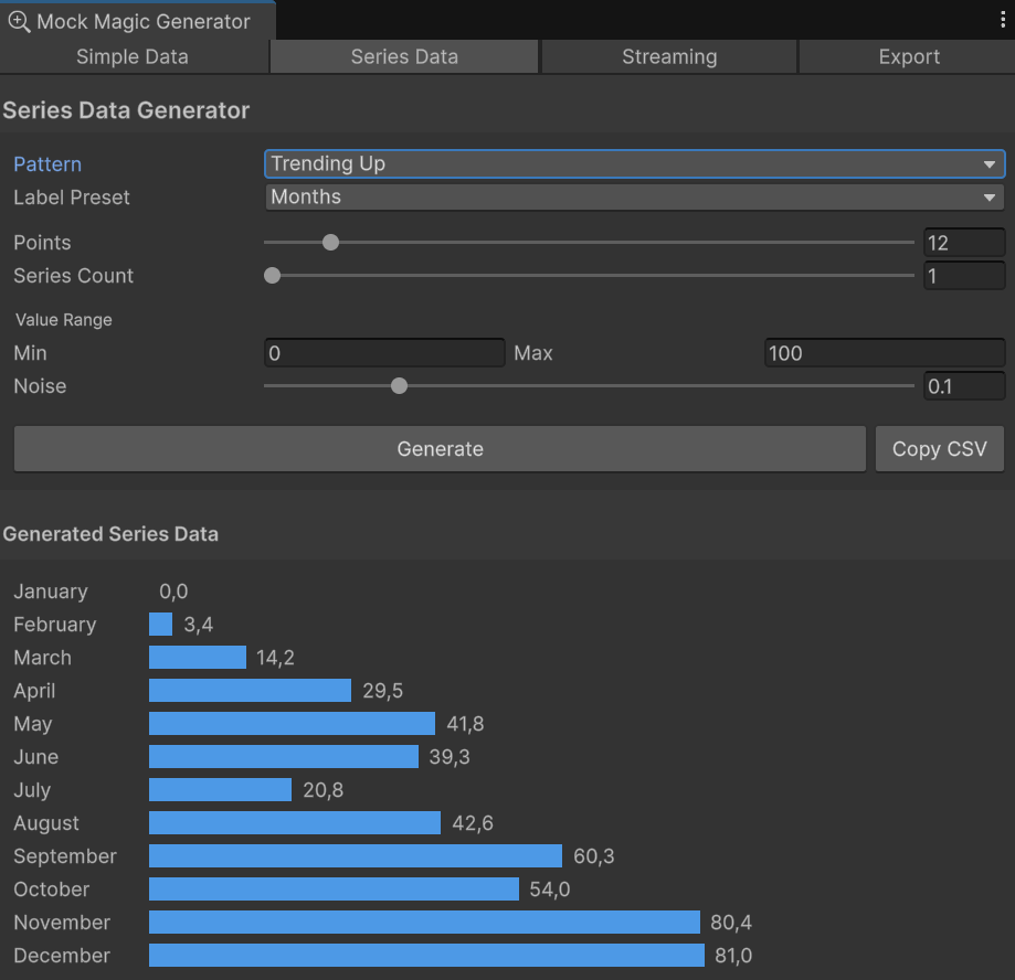
- Generate - Click to produce the dataset. A visual bar preview appears below.
- Copy CSV - Copies the generated data in CSV format to the clipboard.
Visual Preview
After generating, the Series Data tab displays an inline horizontal bar chart. Each data point shows its label, a colored bar proportional to the value, and the numeric value. For multi-series data, series are separated by name headers.
The Data Point Structure
Every generated series data point is a MockDataPoint with five fields:
Field | Description |
|---|---|
Label | The X-axis category label (e.g., "Jan", "Q1", "North") |
Value | The primary Y-axis value |
SecondaryValue | An optional secondary value, useful for range/band charts |
SeriesIndex | Which series this point belongs to (0-based) |
SeriesName | The name of the series (e.g., "Revenue", "Series 1") |
Scripting: Access these fields directly - point.Label, point.Value, point.SeriesName, etc.
Pattern Reference
Pattern | Description |
|---|---|
Random | Uniformly random values between min and max. Good for bar charts and scatter data. |
Linear | Steady progression from min to max. A clean diagonal line. |
Exponential | Slow start that accelerates sharply upward. Growth curves and compound metrics. |
Logarithmic | Fast initial rise that flattens out. Diminishing returns, learning curves. |
Sine | Smooth wave oscillating around the midpoint. Cyclic patterns, audio-like data. |
Cosine | Same as Sine but phase-shifted by 90°. Starts at the peak. |
TrendingUp | General upward movement with random walk noise. Revenue growth, user acquisition. |
TrendingDown | General downward movement with random walk noise. Decline metrics, churn. |
Seasonal | Sine wave combined with a linear upward trend. Monthly sales with yearly seasonality. |
Stepped | Staircase pattern with flat plateaus. Pricing tiers, plan upgrades. |
Sparse | 70% zero values, 30% random non-zero spikes. Event data, error logs. |
RandomWalk | Cumulative random steps from the midpoint. Stock prices, financial data. |
BellCurve | Normal distribution shape centered at the midpoint. Survey results, test scores. |
Sawtooth | Repeating ramp-up pattern. Periodic resets, charge/discharge cycles. |
GaussianNoise | Random noise drawn from a Gaussian (normal) distribution centred on the midpoint. Useful for sensor jitter and measurement-error simulations. |
Multi-Series Data
Set Series Count to more than 1 to generate multiple series sharing the same labels. Each series follows the selected pattern independently but uses the same label axis. This is ideal for:
- Grouped bar charts - comparing categories across series
- Multi-line charts - overlaying trends
- Stacked area charts - showing composition over time
Series are automatically named "Series 1", "Series 2", etc. unless custom names are provided.
Understanding Noise
The Noise slider (0–0.5) adds controlled randomness to any pattern:
- 0 - Perfectly clean mathematical pattern. Useful for demonstrations or when you need exact shapes.
- 0.05–0.15 - Subtle variation. Data looks realistic without losing the pattern shape. This is the sweet spot for most chart testing.
- 0.3–0.5 - Heavy noise. The underlying pattern is still visible but data looks rough and organic.
All values are clamped to the min/max range after noise is applied, so noise never produces out-of-bounds values.