Chart Types and When to Use Them
Chart type | Best use | Notes |
|---|---|---|
Bar | Compare values across categories. | Use BarLayout.Horizontal for long category names. Supports rounded corners, ranges, grouping, and stacking. |
Line | Show change over time or ordered X values. | Supports Linear, Monotone, CatmullRom, Cardinal, Natural, and Step interpolation modes. |
Area | Show trend plus magnitude. | Can fill below a line or between ranges. Supports stacking and centered streamgraph style. |
Point / Scatter / Bubble | Show individual observations or relationships. | Use symbols and symbol size scale for additional dimensions. |
Pie / Donut | Show simple part-to-whole composition. | Use sparingly. Works best with a small number of slices and clear labels. |
Radar | Compare several attributes per entity. | Useful for profiles, skill charts, and multi-axis comparison. |
HeatMap | Show intensity across a two-dimensional grid. | Built from RectangleMark and color scales. |
Candlestick | Show financial OHLC data. | Uses open, high, low, close columns or CandleStickMark values. |
Sparkline / MiniBar / MiniPie / MiniDonut / Indicator | Embed compact values in HUDs, dashboards, tables, or inspector panels. | Compact types hide axes and reduce padding by default. |
Choosing a chart type
- Use bar charts for ranking and category comparison.
- Use line charts for a trend where order matters.
- Use area charts when accumulated magnitude or range matters.
- Use scatter or bubble charts when both X and Y are measured values.
- Use heatmaps when a matrix pattern matters more than individual numbers.
- Use compact charts when the chart is a supporting signal, not the whole focus.
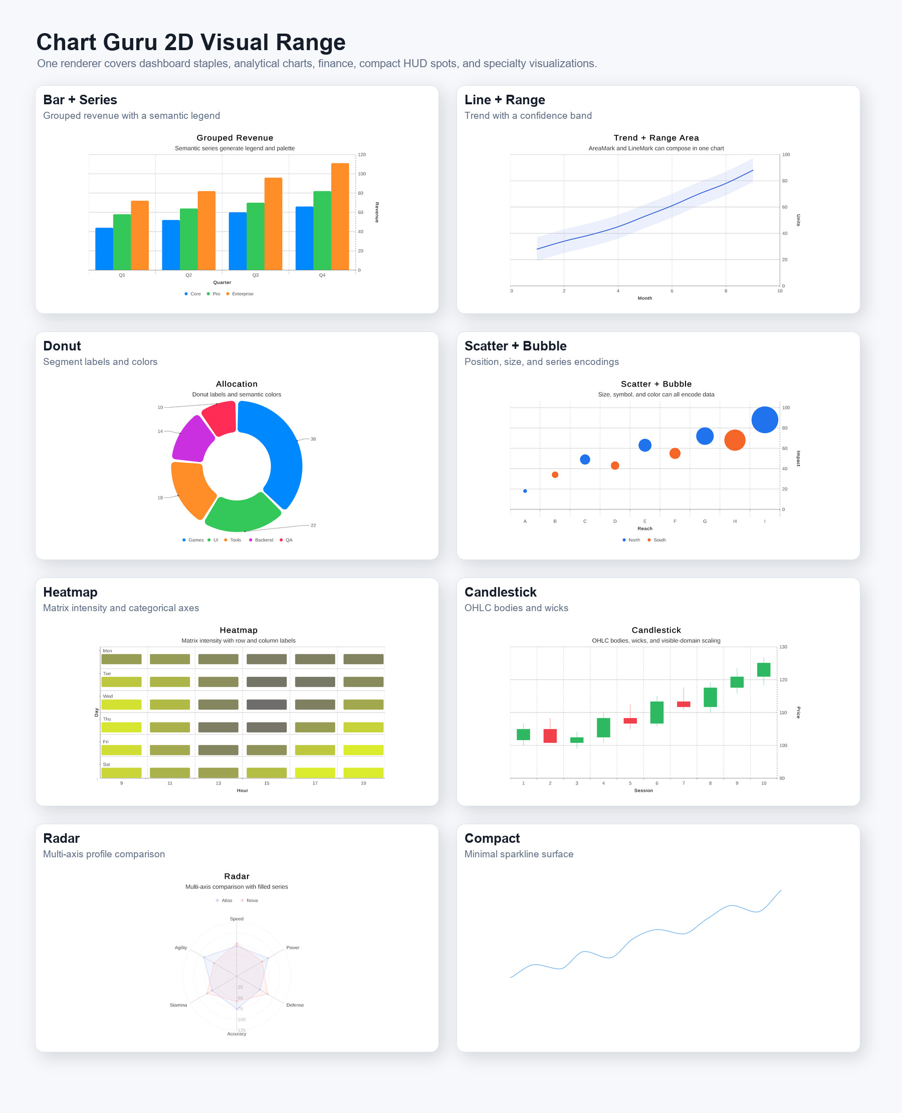
Figure 3. 2D chart type showcase: grouped bars, line and area trends, donut composition, scatter and bubble, heatmap, candlestick, radar, and compact dashboard charts.