Styling, Layout, and Labels
Themes
ChartTheme is a ScriptableObject that controls palette, text sizes, axis colors, grid colors, background, plot styling, shadows, glow, animation defaults, and text scaling. Assign a theme in the builder, ChartGraphic, ChartComponent, or ChartGuruElement. Mark opacity applies consistently to bars, points, sectors, and the other rendered mark families.
Chart chart = Chart.Create()
    .Theme(myTheme)
    .ChartTitle("Revenue")
    .ChartLegend(LegendPosition.Bottom)
    .Build();
Chart Area and Plot Area
Use the chart area settings for the outer background and border. Use plot area settings for the data region background, border, corner radius, and padding. This distinction matters when you want a card-like chart frame but a clean data plot inside it.
Axes and Scales
Axes can be automatic or explicitly configured. Use domains when the chart should keep a stable range. Use categorical or band axes for named categories, time axes for dates, logarithmic or symmetric-log scales for broad numeric ranges, and power scales when a non-linear transform is needed.
Chart chart = builder
    .ChartXAxis(x => x.Label("Month").TickCount(6))
    .ChartYAxis(y => y.Label("Revenue").Domain(0, 100).TickFormat("F0"))
    .ChartYScale(0, 100)
    .Build();
Use AutomaticTickCount() when the numeric tick interval should adapt to the domain. Use TickCount or explicit values/stride when a fixed authoring policy matters. Axis-line and tick visibility are separate: configure AxisConfig.ShowAxisLine and AxisConfig.ShowTicks independently. Keep explicit axis label/title colors when contrast requirements need a deliberate choice.
For 2D symbol styling, SymbolSize(float) is a diameter in logical chart units. Swift Charts numeric symbol sizes represent perceived area and are converted during import; do not copy those numeric areas directly into the C# diameter API.
Titles, Labels, and Annotations
Use the chart title for the main message and subtitle for context. Data labels show values on marks. Annotations attach explanatory text to a mark or reference line. RuleMark is the preferred way to add targets, thresholds, or baselines.
using ChartGuru;
using UnityEngine;

public static class AnnotationExample
{
    public static Chart Create()
    {
        RuleMark target = RuleMark.Horizontal(100f)
            .ForegroundStyle(Color.green)
            .LineStyle(new[] { 8f, 4f })
            .Annotation(AnnotationPosition.TopLeading, "Target")
            .AnnotationSpacing(4f)
            .AnnotationFont(14f)
            .AnnotationOverflowResolution(AnnotationOverflowConfig.Fit());

        return Chart.Create()
            .Add(new BarMark(0f, 80f))
            .Add(new BarMark(1f, 120f))
            .Add(target)
            .Build();
    }
}
AnnotationSpacing controls the gap from the mark, and AnnotationFont supplies an explicit size in logical points; a zero font size inherits the theme. AnnotationOverflowConfig can configure X and Y overflow independently and choose a plot or chart boundary. Keep rule-stroke styling and annotation-text styling separate. Swift import preserves supported spacing, font and per-axis overflow settings, as well as supported numeric annotation formatting; inspect diagnostics for unsupported typography or interpolation formats.
Per-mark and reference-rule annotation text is currently rendered by the Canvas host. UI Toolkit and IMGUI hosts do not yet render those annotations; use their supported data labels or an application-owned overlay, and check the final host when moving a chart between rendering paths.
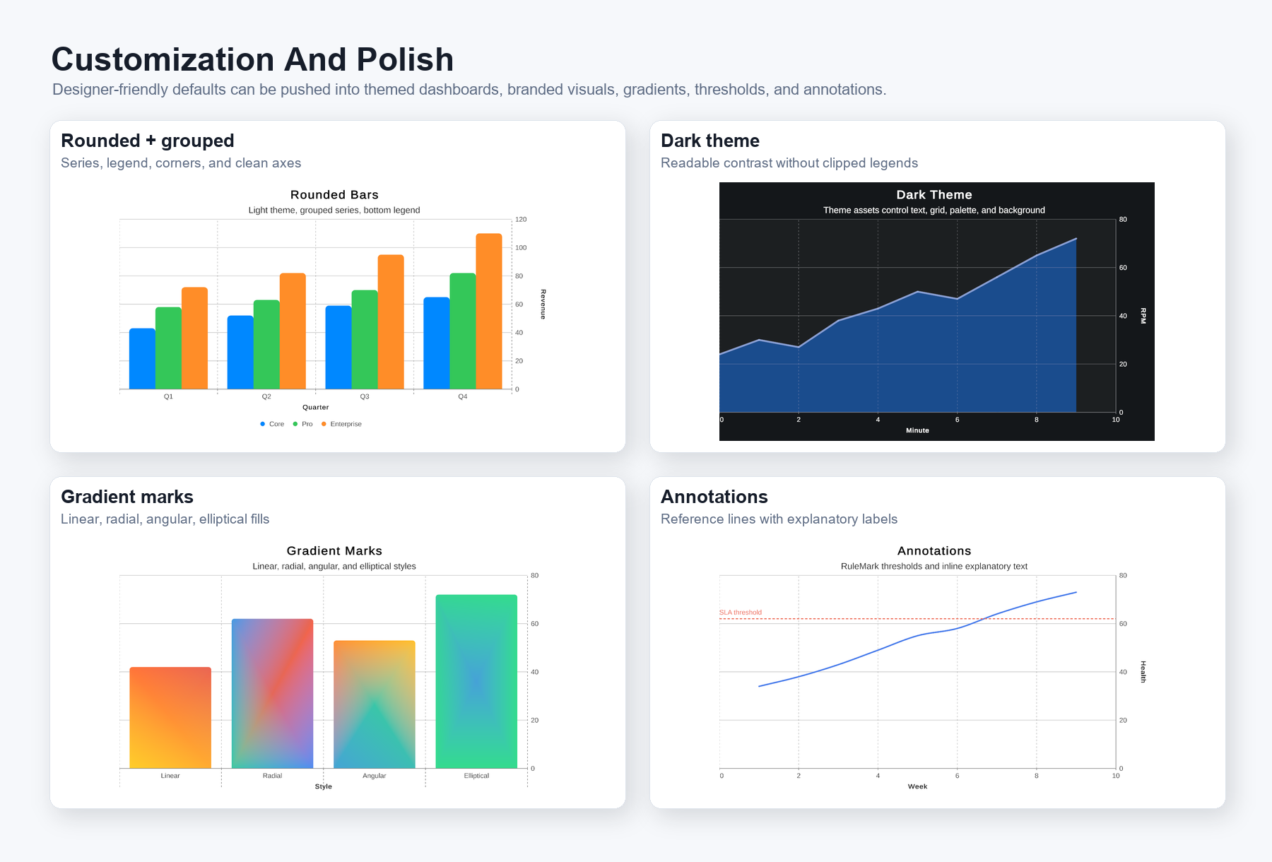
Figure 4. Customization gallery: rounded layouts, dark themes, gradient marks, and target annotations can be mixed without changing the data model.