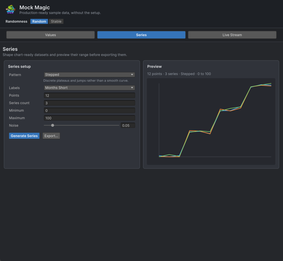
Series Data
The Series workspace generates patterned numerical datasets for charts, graphs, dashboards, and data visualizations. Each dataset consists of labeled data points that follow a mathematical pattern.
This lets charts and analytical interfaces communicate a real scenario before production metrics exist. Create growth, seasonality, comparison, sparse-event, distribution, or financial-style data with a recognizable shape instead of hand-authoring disposable arrays.
Using the Series Workspace
- Pattern - Select from 15 mathematical patterns (see Pattern Reference below).
- Label Preset - Choose how data points are labeled on the X-axis: months, weekdays, quarters, numeric indices, and more.
- Points - Set how many data points to generate per series (3–1000).
- Series Count - Generate multiple series at once (1–10). Useful for grouped/stacked charts or comparisons.
- Min / Max - Define the value range for generated data.
- Noise - Add randomness to the pattern (0 = perfectly clean, 0.5 = very noisy). Noise makes data look more realistic.
- Generate Series - Produce the dataset and inspect its responsive line preview.
- Export - Open the export panel beside the result, choose CSV, then Copy or Save to File.
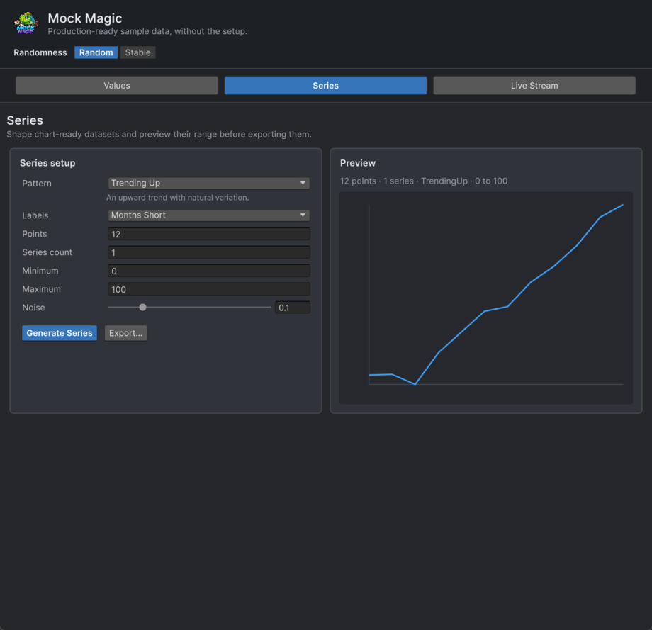
Visual Preview
After generating, the Series workspace displays a responsive preview that supports multiple series, crossings, and negative values. Labels and values stay visible while you verify the data shape.
Custom Labels
Choose Custom in the label preset, enter comma-separated or newline-separated labels, then Generate Series. At least one non-empty label is required. When the point count exceeds the supplied label count, labels repeat, so provide enough distinct labels when your consumer requires uniqueness.
The Data Point Structure
Every generated series data point is a MockDataPoint with five fields:
Field | Description |
|---|---|
Label | The X-axis category label (e.g., "Jan", "Q1", "North") |
Value | The primary Y-axis value |
SecondaryValue | An optional secondary value, useful for range/band charts |
SeriesIndex | Which series this point belongs to (0-based) |
SeriesName | The name of the series (e.g., "Revenue", "Series 1") |
Scripting: Access these fields directly - point.Label, point.Value, point.SeriesName, etc.
Pattern Reference
Pattern | Description |
|---|---|
Random | Uniformly random values between min and max. Good for bar charts and scatter data. |
Linear | Steady progression from min to max. A clean diagonal line. |
Exponential | Slow start that accelerates sharply upward. Growth curves and compound metrics. |
Logarithmic | Fast initial rise that flattens out. Diminishing returns, learning curves. |
Sine | Smooth wave oscillating around the midpoint. Cyclic patterns, audio-like data. |
Cosine | Same as Sine but phase-shifted by 90°. Starts at the peak. |
TrendingUp | General upward movement with random walk noise. Revenue growth, user acquisition. |
TrendingDown | General downward movement with random walk noise. Decline metrics, churn. |
Seasonal | Sine wave combined with a linear upward trend. Monthly sales with yearly seasonality. |
Stepped | Staircase pattern with flat plateaus. Pricing tiers, plan upgrades. |
Sparse | 70% zero values, 30% random non-zero spikes. Event data, error logs. |
RandomWalk | Cumulative random steps from the midpoint. Stock prices, financial data. |
BellCurve | Normal distribution shape centered at the midpoint. Survey results, test scores. |
Sawtooth | Repeating ramp-up pattern. Periodic resets, charge/discharge cycles. |
GaussianNoise | Random noise drawn from a Gaussian (normal) distribution centred on the midpoint. Useful for sensor jitter and measurement-error simulations. |
Multi-Series Data
Set Series Count to more than 1 to generate multiple series sharing the same labels. Each series follows the selected pattern independently but uses the same label axis. This is ideal for:
- Grouped bar charts - comparing categories across series
- Multi-line charts - overlaying trends
- Stacked area charts - showing composition over time
Series are automatically named "Series 1", "Series 2", etc. unless custom names are provided.
Understanding Noise
The Noise slider (0–0.5) adds controlled randomness to any pattern:
- 0 - Perfectly clean mathematical pattern. Useful for demonstrations or when you need exact shapes.
- 0.05–0.15 - Subtle variation. Data looks realistic without losing the pattern shape. This is the sweet spot for most chart testing.
- 0.3–0.5 - Heavy noise. The underlying pattern is still visible but data looks rough and organic.
All values are clamped to the min/max range after noise is applied, so noise never produces out-of-bounds values.